Pyplot Tutorial
Import
import matplotlib.pyplot as plt
import numpy as np
%matplotlib inline
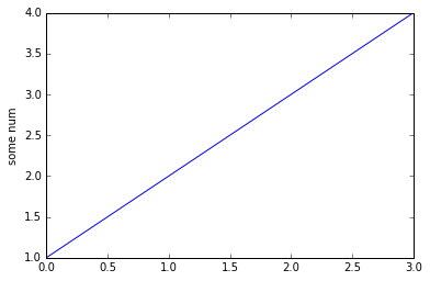
Basic Plot
plt.plot([1,2,3,4]) # basic plot
plt.ylabel("some num")
plt.show()
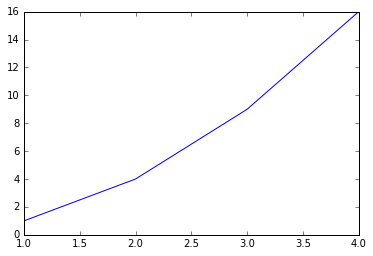
plt.plot([1,2,3,4],[1,4,9,16]) # plot x versus y
plt.show()
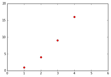
Add Some Style
# borrowed from Matlab
plt.plot([1,2,3,4], [1,4,9,16], 'ro')
plt.axis([0, 6, 0, 20]) # [xmin, xmax, ymin, ymax]
plt.show()
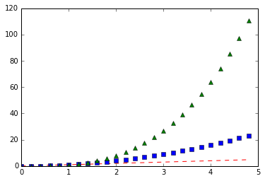
t = np.arange(0.,5.,0.2)
# more style here
# http://matplotlib.org/api/pyplot_api.html#matplotlib.pyplot.plot
plt.plot(t,t,'r--', t,t**2,'bs', t,t**3,'g^')
plt.show()
Multiple figures and axes
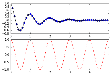
MATLAB, and pyplot, have the concept of the current figure and the current axes. All plotting commands apply to the current axes. The function gca() returns the current axes (a matplotlib.axes.Axes instance), and gcf() returns the current figure (matplotlib.figure.Figure instance).
def f(t):
    return np.exp(-t)*np.cos(2*np.pi*t)
t1 = np.arange(0.0,5.0,0.1)
t2 = np.arange(0.0,5.0,0.02)
plt.figure(1)
# The subplot() command specifies numrows, numcols, fignum where fignum ranges from 1 to numrows*numcols
plt.subplot(211)
plt.plot(t1, f(t1), 'bo', t2, f(t2), 'k');
plt.subplot(212)
plt.plot(t2,np.cos(2*np.pi*t2),'r--');
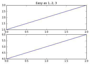
plt.figure(1) # the first figure
plt.subplot(211) # the first subplot in the first figure
plt.plot([1, 2, 3])
plt.subplot(212) # the second subplot in the first figure
plt.plot([4, 5, 6])
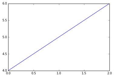
plt.figure(2) # a second figure
plt.plot([4, 5, 6]) # creates a subplot(111) by default
plt.figure(1) # figure 1 current; subplot(212) still current
plt.subplot(211) # make subplot(211) in figure1 current
plt.title('Easy as 1, 2, 3');
More method on figure and axes:
- You can clear the current figure with clf() and the current axes with cla().
- The memory required for a figure is not completely released until the figure is explicitly closed with close().
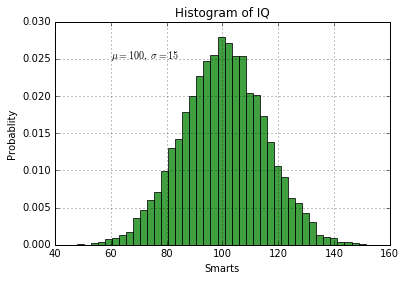
Working with text
The text() command can be used to add text in an arbitrary location, and the xlabel(), ylabel() and title() are used to add text in the indicated locations.
mu, sigma = 100, 15
x = mu + sigma*np.random.randn(10000)

n, bins, patches = plt.hist(x,50,normed=1,facecolor='g',alpha=0.75)
plt.xlabel('Smarts')
plt.ylabel('Probablity')
plt.title('Histogram of IQ')
plt.text(60,.025,r'$\mu=100,\ \sigma=15$')
plt.axis([40,160,0,0.03])
plt.grid(True)
plt.show()
Basic figure features
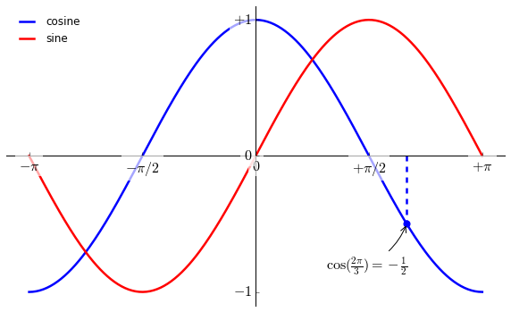
Moving spines
Spines are the lines connecting the axis tick marks and noting the boundaries of the data area. They can be placed at arbitrary positions and until now, they were on the border of the axis. We'll change that since we want to have them in the middle. Since there are four of them (top/bottom/left/right), we'll discard the top and right by setting their color to none and we'll move the bottom and left ones to coordinate 0 in data space coordinates.
X = np.linspace(-np.pi, np.pi, 256, endpoint=True)
C,S = np.cos(X), np.sin(X)

# new figure
plt.figure(figsize=(10,6),dpi=80)

# add style
plt.plot(X,C,color='blue',linewidth=2.5,linestyle='-',label="cosine")
plt.plot(X,S,color='red',linewidth=2.5,linestyle='-',label="sine")

# setting limits
plt.xlim(X.min()*1.1,X.max()*1.1)
plt.ylim(C.min()*1.1,C.max()*1.1)

# setting ticks
plt.xticks([-np.pi,-np.pi/2,0,np.pi/2,np.pi],
          [r'$-\pi$', r'$-\pi/2$', r'$0$', r'$+\pi/2$', r'$+\pi$'])
plt.yticks([-1,0,1],
          [r'$-1$', r'$0$', r'$+1$'])

# moving spines
ax = plt.gca() # get current axis
ax.spines['right'].set_color('none')
ax.spines['top'].set_color('none')
ax.xaxis.set_ticks_position('bottom')
ax.spines['bottom'].set_position(('data',0))
ax.yaxis.set_ticks_position('left')
ax.spines['left'].set_position(('data',0))

# legend
plt.legend(loc='upper left',frameon=False)

# annotate some points
t = 2*np.pi/3
plt.plot([t,t],[0,np.cos(t)], color ='blue', linewidth=2.5, linestyle="--")
plt.scatter([t,],[np.cos(t),],50,color='blue')
plt.annotate(r'$\cos(\frac{2\pi}{3})=-\frac{1}{2}$',
             xy=(t, np.cos(t)), xycoords='data',
             xytext=(-90, -50), textcoords='offset points', fontsize=16,
             arrowprops=dict(arrowstyle="->", connectionstyle="arc3,rad=.2"))

# make label bigger
for label in ax.get_xticklabels() + ax.get_yticklabels():
    label.set_fontsize(16)
    label.set_bbox(dict(facecolor='white', edgecolor='None', alpha=0.65 ))

plt.show()
More Types
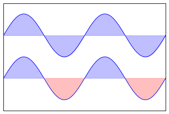
Regular Plot
# plt.fill_between(x, y1, y2=0, where=None)
# x : array
#     An N-length array of the x data
# y1 : array
#     An N-length array (or scalar) of the y data
# y2 : array
#     An N-length array (or scalar) of the y data

n = 256
X = np.linspace(-np.pi,np.pi,n,endpoint=True)
Y = np.sin(2*X)

plt.plot(X,Y+1,color='blue',alpha=1.00)
plt.fill_between(X,1,Y+1,color='blue',alpha=.25) # x, y1, y2

plt.plot(X,Y-1,color='blue',alpha=1.00)
plt.fill_between(X,-1,Y-1,(Y-1)>-1,color='blue',alpha=.25) # where condition
plt.fill_between(X,-1,Y-1,(Y-1)<-1,color='red',alpha=.25)

plt.xlim(-np.pi,np.pi), plt.xticks([])
plt.ylim(-2.5,2.5), plt.yticks([])
plt.show()
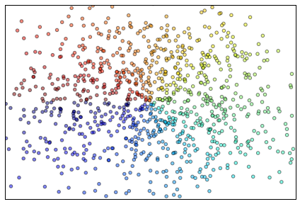
Scatter Plots
n = 1024
X = np.random.normal(0,1,n)
Y = np.random.normal(0,1,n)
T = np.arctan2(Y,X)

plt.axes([0.025,0.025,0.95,0.95])
plt.scatter(X,Y,c=T,alpha=.5) #color

plt.xlim(-2,2), plt.xticks([])
plt.ylim(-2,2), plt.yticks([])

plt.show()
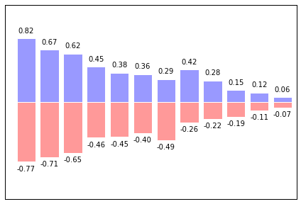
Bar Plots
n = 12
X = np.arange(n)
Y1 = (1-X/float(n))*np.random.uniform(0.5,1.0,n)
Y2 = (1-X/float(n))*np.random.uniform(0.5,1.0,n)

plt.axes([0.025,0.025,0.95,0.95])
plt.bar(X,+Y1,facecolor='#9999ff',edgecolor='white')
plt.bar(X,-Y2,facecolor='#ff9999',edgecolor='white')

# Make an iterator that aggregates elements from each of the iterables.
# Returns an iterator of tuples, where the i-th tuple contains
# the i-th element from each of the argument sequences or iterables.
for x,y in zip(X,Y1):
    plt.text(x+0.4, y+0.05, '%.2f' % y, ha='center', va= 'bottom')

for x,y in zip(X,-Y2):
    plt.text(x+0.4, y-0.05, '%.2f'%y,ha='center',va='top')

plt.xlim([-.5,n]), plt.xticks([])
plt.ylim([-1.25,1.25]), plt.yticks([])
plt.show()
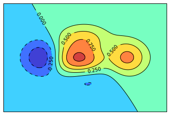
Contour Plots
def f(x,y): return (1-x/2+x**5+y**3)*np.exp(-x**2-y**2)
n = 256
x = np.linspace(-3,3,n)
y = np.linspace(-3,3,n)
X,Y = np.meshgrid(x,y)
# np.meshgrid(*xi, **kwargs), Return coordinate matrices from coordinate vectors.

C = plt.contourf(X,Y,f(X,Y),8,alpha=.75,cmap='jet')
C = plt.contour(X, Y, f(X,Y), 8, colors='black', linewidth=.5)
plt.clabel(C, inline=1, fontsize=10)
# plt.clabel(CS, *args, **kwargs) Label a contour plot.

plt.xticks([]), plt.yticks([])
plt.show()
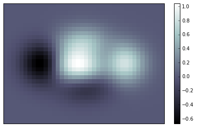
Imshow
def f(x,y): return (1-x/2+x**5+y**3)*np.exp(-x**2-y**2)
n = 10
x = np.linspace(-3,3,4*n)
y = np.linspace(-3,3,3*n)
X,Y = np.meshgrid(x,y)
Z = f(X,Y)
plt.axes([0.025,0.025,0.95,0.95])
plt.imshow(Z,interpolation='nearest',cmap='bone',origin='lower')
plt.colorbar(shrink=0.9)
plt.xticks([])
plt.yticks([])
plt.show()
Pie Charts
n = 20
Z = np.ones(n)
Z[-1] *= 2
plt.axes([0.025,0.025,0.95,0.95])
plt.pie(Z, explode=Z*.05, colors = ['%f' % (i/float(n)) for i in range(n)])
plt.gca().set_aspect('equal')
plt.xticks([]), plt.yticks([])
plt.show()

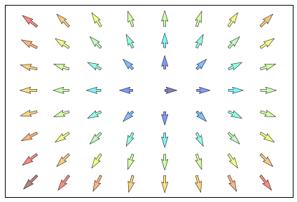
Quiver Plots
n = 8
X,Y = np.mgrid[0:n,0:n]
T = np.arctan2(Y-n/2.0,X-n/2.0)
R = 10+np.sqrt((Y-n/2.0)**2+(X-n/2.0)**2)
U,V = R*np.cos(T), R*np.sin(T)
plt.axes([0.025,0.025,0.95,0.95])

plt.quiver(X,Y,U,V,R,alpha=.5)
plt.quiver(X,Y,U,V,edgecolor='k',facecolor='None',linewidth=0.5)

plt.xlim([-1,n]),plt.xticks([])
plt.ylim([-1,n]),plt.yticks([])
plt.show()
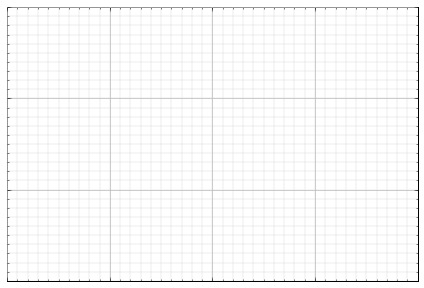
Grids
ax = plt.axes([0.025,0.025,0.95,0.95])

ax.set_xlim(0,4)
ax.set_ylim(0,3)

ax.xaxis.set_major_locator(plt.MultipleLocator(1.0))
ax.xaxis.set_minor_locator(plt.MultipleLocator(0.1))
ax.yaxis.set_major_locator(plt.MultipleLocator(1.0))
ax.yaxis.set_minor_locator(plt.MultipleLocator(0.1))

ax.grid(which='major', axis='x', linewidth=0.75, linestyle='-', color='0.75')
ax.grid(which='minor', axis='x', linewidth=0.25, linestyle='-', color='0.75')
ax.grid(which='major', axis='y', linewidth=0.75, linestyle='-', color='0.75')
ax.grid(which='minor', axis='y', linewidth=0.25, linestyle='-', color='0.75')

ax.set_xticklabels([]) # diff between set_xticks([])
ax.set_yticklabels([]) # with little vertical lines

plt.show()
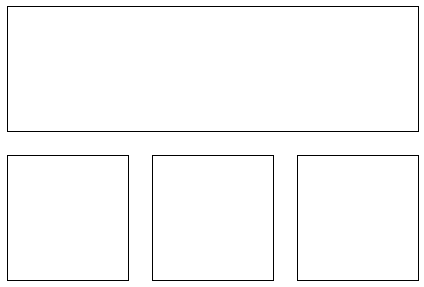
Multi Plots
fig = plt.figure()
fig.subplots_adjust(bottom=0.025,left=0.025,top=0.975,right=0.975)
plt.subplot(2,1,1) # subplots shape (2,1)
plt.xticks([]), plt.yticks([])

plt.subplot(2,3,4) # subplots shape(2,3)
plt.xticks([]), plt.yticks([])

plt.subplot(2,3,5)
plt.xticks([]), plt.yticks([])

plt.subplot(2,3,6)
plt.xticks([]), plt.yticks([])
plt.show()