一款好的APP離不了一個漂亮的布局,本文章將向大家分享React Native中的布局方式FlexBox。 在React Native中布局采用的是FleBox(彈性框)進行布局。
FlexBox提供了在不同尺寸設備上都能保持一致的布局方式。FlexBox是CSS3彈性框布局規范,目前還處于最終征求意見稿 (Last Call Working Draft)階段,并不是所有的瀏覽器都支持Flexbox。但大家在做React Native開發時大可不必擔心FlexBox的兼容性問題,因為既然React Native選擇用FlexBox布局,那么React Native對FlexBox的支持自然會做的很好。
寬和高
在學習FlexBox之前首先要清楚一個概念“寬和高”。一個組件的高度和寬度決定了它在屏幕上的尺寸,也就是大小。
像素無關
在React Native中尺寸是沒有單位的,它代表了設備獨立像素。
<View style={ {width:100,height:100,margin:40,backgroundColor:'gray'}}>
  <Text style={ {fontSize:16,margin:20}}>尺寸</Text>
</View>
上述代碼,運行在Android上時,View的長和寬被解釋成:100dp 100dp單位是dp,字體被解釋成16sp 單位是sp,運行在iOS上時尺寸單位被解釋稱了pt,這些單位確保了布局在任何不同dpi的手機屏幕上顯示不會發生改變;
和而不同
值得一提的是,React Native中的FlexBox 和Web CSSS上FlexBox工作方式是一樣的。但有些地方還是有些出入的,如:
React Native中的FlexBox 和Web CSSS上FlexBox的不同之處
flexDirection: React Native中默認為
flexDirection:'column'
,在Web CSS中默認為flex-direction:'row'alignItems: React Native中默認為
alignItems:'stretch'
,在Web CSS中默認align-items:'flex-start'flex: 相比Web CSS的flex接受多參數,如:
flex: 2 2 10%;
,但在 React Native中flex只接受一個參數不支持屬性:
align-content,flex-basis,order,flex-basis,flex-flow,flex-grow,flex-shrink
以上是React Native中的FlexBox 和Web CSSS上FlexBox的不同之處,記住這幾點,你可以像在Web CSSS上使用FlexBox一樣,在React Native中使用FlexBox。
Layout Props
Flex in React Native
以下屬性是React Native所支持的Flex屬性。
父視圖屬性(容器屬性):
- flexDirection enum(‘row’, ‘column’,’row-reverse’,’column-reverse’)
- flexWrap enum(‘wrap’, ‘nowrap’)
- justifyContent enum(‘flex-start’, ‘flex-end’, ‘center’, ‘space-between’, ‘space-around’)
- alignItems enum(‘flex-start’, ‘flex-end’, ‘center’, ‘stretch’)
主軸和側軸(橫軸和豎軸)
在學習上述屬性之前,讓我們先了解一個概念:主軸和側軸
主軸即水平方向的軸線,可以理解成橫軸,側軸垂直于主軸,可以理解為豎軸。
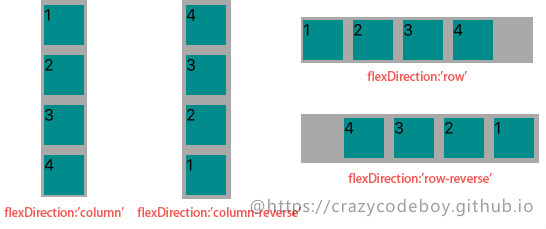
flexDirection
flexDirection enum('row', 'column','row-reverse','column-reverse')
flexDirection屬性定義了父視圖中的子元素沿橫軸或側軸方片的排列方式。
- row: 從左向右依次排列
- row-reverse: 從右向左依次排列
- column(default): 默認的排列方式,從上向下排列
- column-reverse: 從下向上排列
Usage:
<View style={ {flexDirection:'row-reverse',backgroundColor:"darkgray",marginTop:20}}>
  <View style={ {width:40,height:40,backgroundColor:"darkcyan",margin:5}}>
    <Text style={ {fontSize:16}}>1</Text>
  </View>
  <View style={ {width:40,height:40,backgroundColor:"darkcyan",margin:5}}>
    <Text style={ {fontSize:16}}>2</Text>
  </View>
  <View style={ {width:40,height:40,backgroundColor:"darkcyan",margin:5}}>
    <Text style={ {fontSize:16}}>3</Text>
  </View>
  <View style={ {width:40,height:40,backgroundColor:"darkcyan",margin:5}}>
    <Text style={ {fontSize:16}}>4</Text>
  </View>
</View>
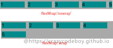
flexWrap
flexWrap enum('wrap', 'nowrap')
flexWrap屬性定義了子元素在父視圖內是否允許多行排列,默認為nowrap。
- nowrap flex的元素只排列在一行上,可能導致溢出。
- wrap flex的元素在一行排列不下時,就進行多行排列。
Usage:
<View style={{flexWrap:'wrap',flexDirection:'row',backgroundColor:"darkgray",marginTop:20}}>
  ···
</View>
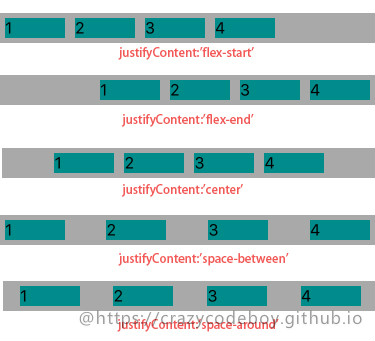
justifyContent
justifyContent enum('flex-start', 'flex-end', 'center', 'space-between', 'space-around')
justifyContent屬性定義了瀏覽器如何分配順著父容器主軸的彈性(flex)元素之間及其周圍的空間,默認為flex-start。
- flex-start(default) 從行首開始排列。每行第一個彈性元素與行首對齊,同時所有后續的彈性元素與前一個對齊。
- flex-end 從行尾開始排列。每行最后一個彈性元素與行尾對齊,其他元素將與后一個對齊。
- center 伸縮元素向每行中點排列。每行第一個元素到行首的距離將與每行最后一個元素到行尾的距離相同。
- space-between 在每行上均勻分配彈性元素。相鄰元素間距離相同。每行第一個元素與行首對齊,每行最后一個元素與行尾對齊。
- space-around 在每行上均勻分配彈性元素。相鄰元素間距離相同。每行第一個元素到行首的距離和每行最后一個元素到行尾的距離將會是相鄰元素之間距離的一半。
Usage:
<View style={ {justifyContent:'center',flexDirection:'row',backgroundColor:"darkgray",marginTop:20}}>
  ···
</View>
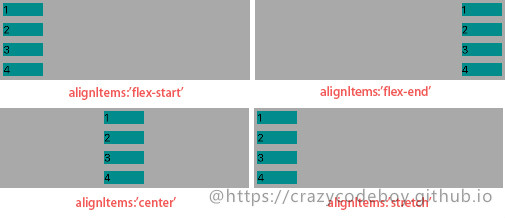
alignItems
alignItems enum('flex-start', 'flex-end', 'center', 'stretch')
alignItems屬性以與justify-content相同的方式在側軸方向上將當前行上的彈性元素對齊,默認為stretch。
- flex-start 元素向側軸起點對齊。
- flex-end 元素向側軸終點對齊。
- center 元素在側軸居中。如果元素在側軸上的高度高于其容器,那么在兩個方向上溢出距離相同。
- stretch 彈性元素被在側軸方向被拉伸到與容器相同的高度或寬度。
Usage:
<View style={ {justifyContent:'center',flexDirection:'row',backgroundColor:"darkgray",marginTop:20}}>
  ···
</View>
子視圖屬性
- alignSelf enum(‘auto’, ‘flex-start’, ‘flex-end’, ‘center’, ‘stretch’)
- flex number
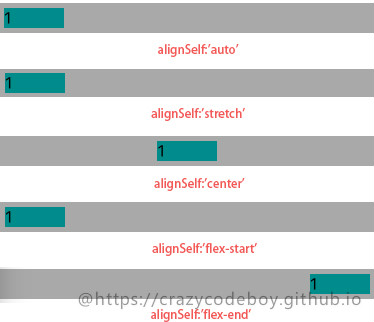
alignSelf
alignSelf enum('auto', 'flex-start', 'flex-end', 'center', 'stretch')
alignSelf屬性以屬性定義了flex容器內被選中項目的對齊方式。注意:alignSelf 屬性可重寫靈活容器的 alignItems 屬性。
- auto(default) 元素繼承了它的父容器的 align-items 屬性。如果沒有父容器則為 “stretch”。
- stretch 元素被拉伸以適應容器。
- center 元素位于容器的中心。
- flex-start 元素位于容器的開頭。
- flex-end 元素位于容器的結尾。
Usage:
<View style={ {alignSelf:'baseline',width:60,height: 20,backgroundColor:"darkcyan",margin:5}}>
  <Text style={ {fontSize:16}}>1</Text>
</View>
...
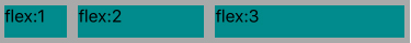
flex
flex number
flex 屬性定義了一個可伸縮元素的能力,默認為0。 >
Usage:
<View style={ {flexDirection:'row',height:40, backgroundColor:"darkgray",marginTop:20}}>
  <View style={ {flex:1,backgroundColor:"darkcyan",margin:5}}>
    <Text style={ {fontSize:16}}>flex:1</Text>
  </View>
  <View style={ {flex:2,backgroundColor:"darkcyan",margin:5}}>
    <Text style={ {fontSize:16}}>flex:2</Text>
  </View>
  <View style={ {flex:3,backgroundColor:"darkcyan",margin:5}}>
    <Text style={ {fontSize:16}}>flex:3</Text>
  </View>
</View>
其他布局 in React Native
以下屬性是React Native所支持的除Flex以外的其它布局屬性。
視圖邊框
- borderBottomWidth number 底部邊框寬度
- borderLeftWidth number 左邊框寬度
- borderRightWidth number 右邊框寬度
- borderTopWidth number 頂部邊框寬度
- borderWidth number 邊框寬度
- border<Bottom
Left
Right
Top>Color 個方向邊框的顏色
borderColor 邊框顏色
尺寸
- width number
- height number
外邊距
- margin number 外邊距
- marginBottom number 下外邊距
- marginHorizontal number 左右外邊距
- marginLeft number 左外邊距
- marginRight number 右外邊距
- marginTop number 上外邊距
- marginVertical number 上下外邊距
內邊距
- padding number 內邊距
- paddingBottom number 下內邊距
- paddingHorizontal number 左右內邊距
- paddingLeft number 做內邊距
- paddingRight number 右內邊距
- paddingTop number 上內邊距
- paddingVertical number 上下內邊距
邊緣
- left number 屬性規定元素的左邊緣。該屬性定義了定位元素左外邊距邊界與其包含塊左邊界之間的偏移。
- right number 屬性規定元素的右邊緣。該屬性定義了定位元素右外邊距邊界與其包含塊右邊界之間的偏移
- top number 屬性規定元素的頂部邊緣。該屬性定義了一個定位元素的上外邊距邊界與其包含塊上邊界之間的偏移。
- bottom number 屬性規定元素的底部邊緣。該屬性定義了一個定位元素的下外邊距邊界與其包含塊下邊界之間的偏移。
定位(position)
position enum(‘absolute’, ‘relative’)屬性設置元素的定位方式,為將要定位的元素定義定位規則。
- absolute:生成絕對定位的元素,元素的位置通過 “left”, “top”, “right” 以及 “bottom” 屬性進行規定。
- relative:生成相對定位的元素,相對于其正常位置進行定位。因此,”left:20” 會向元素的 LEFT 位置添加 20 像素。
參考
A Complete Guide to Flexbox
Using CSS flexible boxes
Layout with Flexbox
Layout Props
