Android Material Design支持庫(kù)提供了一些新組件,我們?cè)谶@里簡(jiǎn)要的介紹一下這些組件,以及如何使用這些組件。
我是Material Design的粉絲,它使應(yīng)用程序更具有一致性和整體性,而且看起來(lái)更美觀,更容易使用。
Google I / O大會(huì)2015年引進(jìn)一些很棒的新Android特性,包括新的Material Design支持庫(kù)。
Material Design的介紹: Material Design Guidelines (譯注:請(qǐng)自備梯子)
讓我們一起來(lái)看看這些我們現(xiàn)在能用的新組件。
Snackbar
Snackbar是帶有動(dòng)畫(huà)效果的快速提示條,它只會(huì)出現(xiàn)在屏幕底部。
它基本上繼承了Toast的方法和屬性,但與Toast不同的是,Snackbar上可以帶有按鈕,
當(dāng)Snackbar出現(xiàn)時(shí),用戶可以點(diǎn)擊按鈕做相應(yīng)的處理;
Snackbar支持滑動(dòng)消失,類似通知欄的消息;
如果用戶沒(méi)做任何操作,Snackbar在到達(dá)設(shè)定的時(shí)間后也會(huì)自動(dòng)消失。

對(duì)開(kāi)發(fā)者來(lái)說(shuō),我們只要簡(jiǎn)單的幾行代碼就可以實(shí)現(xiàn)Snackbar
Snackbar.make(mDrawerLayout, "Your message", Snackbar.LENGTH_SHORT)
    .setAction(getString(R.string.text_undo), this)
    .show();
注意: 不能同時(shí)顯示多個(gè)Snackbar
Floating Action Button
Floating Action Button (FAB)是一個(gè)懸浮按鈕, 它主要用于一些重要的操作,比如在列表界面上新增按鈕。
現(xiàn)在我們可以在程序里很容易實(shí)現(xiàn)Floating Action Button,不再需要其他三方庫(kù)的支持。
這個(gè)按鈕我們使用時(shí)一般用以下2中尺寸:
Normal (56dp)?—?大部分情況下使用
Mini (40dp)?—?只有在與屏幕上其他組件保持一致性的時(shí)候使用

Normal (left) 和 Mini (right) FAB 按鈕
FAB按鈕默認(rèn)會(huì)使用主題中定義的背景色,但我們也可以很容易的修改背景色,以下是一些我們一般會(huì)修改的屬性:
- fabSize - 設(shè)定FAB的大小 (‘normal’ or ‘mini’)
- backgroundTint - 設(shè)置邊框大小
- rippleColor - 設(shè)定按下時(shí)的顏色
- src - 設(shè)定在FAB中顯示的圖標(biāo)
- layout_anchor - 設(shè)置顯示坐標(biāo)的錨點(diǎn)
- layout_anchorGravity - 設(shè)置錨點(diǎn)的對(duì)齊方式
我們只要簡(jiǎn)單加入以下代碼,就可以實(shí)現(xiàn)FAB:
<android.support.design.widget.FloatingActionButton
     android:id=”@+id/fab_normal”
     android:layout_width=”wrap_content”
     android:layout_height=”wrap_content”
     android:src=”@drawable/ic_plus”
     app:fabSize=”normal” />
EditText Floating Labels
TextInputLayout主要用于包含EditText,會(huì)默認(rèn)生成一個(gè)浮動(dòng)的Label, 當(dāng)我們選擇EditText時(shí), EditText中設(shè)置的hint會(huì)上浮到EditText的左上角.
這對(duì)提交用戶數(shù)據(jù)很有用。
實(shí)現(xiàn)很簡(jiǎn)單,只要包含EditText就可以了:
<android.support.design.widget.TextInputLayout
    android:layout_width="match_parent"
    android:layout_height="wrap_content">

    <EditText
        android:id="@+id/edit_text_email"
        android:layout_width="match_parent"
        android:layout_height="wrap_content"
        android:inputType="textEmailAddress"
        android:hint="@string/hint_email" />

</android.support.design.widget.TextInputLayout>
它同時(shí)支持顯示錯(cuò)誤信息, 我們主要加入如下代碼即可:
setErrorEnabled(true);
setError(getString(R.string.text_error_message));
*注意: * 設(shè)置錯(cuò)誤信息需要在setErrorEnabled標(biāo)志之后,這樣可以保證在錯(cuò)誤出現(xiàn)時(shí)layout大小不發(fā)生變化
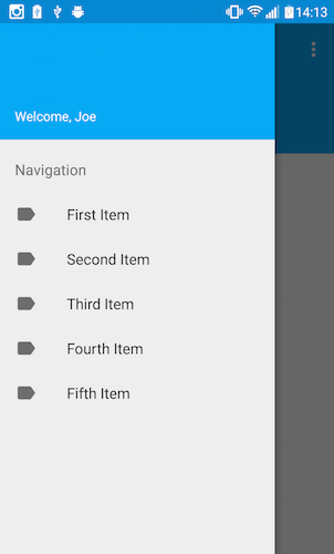
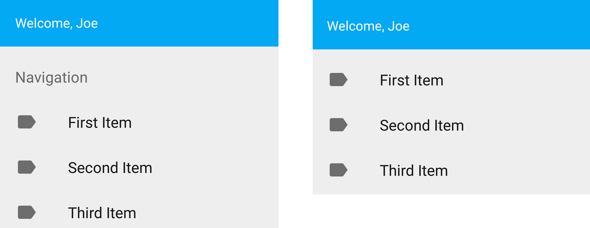
Navigation View
Navigation Drawer在現(xiàn)在的APP中很常見(jiàn), 以前實(shí)現(xiàn)一直不怎么容易,
現(xiàn)在提供的NavigationView組件可以直接放在DrawerLayout中,
通過(guò)設(shè)置menu resource就能顯示菜單項(xiàng)了。
<android.support.v4.widget.DrawerLayout
    xmlns:android="http://schemas.android.com/apk/res/android"
    xmlns:app="http://schemas.android.com/apk/res-auto"
    android:id="@+id/drawer_layout"
    android:layout_width="match_parent"
    android:layout_height="match_parent"
    android:fitsSystemWindows="true">

    <FrameLayout
        android:id="@+id/main_content_frame"
        android:layout_width="match_parent"
        android:layout_height="match_parent" />

    <android.support.design.widget.NavigationView
        android:id="@+id/navigation_view"
        android:layout_width="wrap_content"
        android:layout_height="match_parent"
        android:layout_gravity="start"
        app:headerLayout="@layout/navigation_header"
        app:menu="@menu/drawer" />

</android.support.v4.widget.DrawerLayout>
這個(gè)View有兩個(gè)主要屬性:
Header Layout
headerLayout是一個(gè)可選得屬性,通過(guò)設(shè)置它我們可以在導(dǎo)航欄上面增加一個(gè)Header,通用的做法我們?cè)谏厦骘@示用戶信息。
Menu
menu屬性用來(lái)定義需要引用的menu resource。
如下所示, NavigationView menus我們一般有兩張用法,第一種是使用標(biāo)準(zhǔn)的單選模式:
<menu xmlns:android="http://schemas.android.com/apk/res/android"
    xmlns:tools="http://schemas.android.com/tools"
    tools:context=".MainActivity">
    <group android:checkableBehavior="single">
        <item
            android:id="@+id/navigation_item_1"
            android:checked="true"
            android:icon="@drawable/ic_android"
            android:title="@string/navigation_item_1" />
        <item
            android:id="@+id/navigation_item_2"
            android:icon="@drawable/ic_android"
            android:title="@string/navigation_item_2" />
    </group>
</menu>
這樣菜單項(xiàng)只是簡(jiǎn)單的羅列,所有的菜單項(xiàng)都屬于同一個(gè)分組。
第二種用法也是相似的,不過(guò)我們可以進(jìn)行分組,給每一個(gè)分組定義標(biāo)題,如下所示:
<menu xmlns:android="http://schemas.android.com/apk/res/android"
    xmlns:tools="http://schemas.android.com/tools"
    tools:context=".MainActivity">
    <group android:checkableBehavior="single">
        <item
            android:id="@+id/navigation_subheader"
            android:title="@string/nav_header">
            <menu>
                <!-- Menu items go here -->
            </menu>
         </item>
    </group>
</menu>
這樣我們就可以把我們的菜單項(xiàng)進(jìn)行分組,這還是很有用得,我們可以按功能把菜單項(xiàng)進(jìn)行分組。
還有一些重要屬性的屬性我們可以設(shè)置,如下:
- itemBackground?—?設(shè)置菜單項(xiàng)的背景
- itemIconTint?—?設(shè)置菜單項(xiàng)的圖標(biāo)
- itemTextColor?—?這只菜單項(xiàng)目的文本顏色
我們可以通過(guò)實(shí)現(xiàn)OnNavigationItemSelectedListener方法,處理菜單項(xiàng)的點(diǎn)擊事件。
注意: For API21+, the NavigationView automatically takes care of scrim protection for the status bar.
TabLayout
TabLayout可以很容易地在APP中添加Tab分組功能
我們有好幾種方式來(lái)使用它:
-
固定Tabs,根據(jù)View的寬度適配

-
固定Tabs, 在View中居中顯示

可滑動(dòng)的Tabs
要實(shí)現(xiàn)上述效果,首先我們需要加入TabLayout:
<android.support.design.widget.TabLayout
    android:id="@+id/sliding_tabs"
    android:layout_width="match_parent"
    android:layout_height="wrap_content"
    app:tabMode="fixed"
    app:tabGravity="fill" />
然后, 我們可以通過(guò)以下這些屬性調(diào)整TabLayout的外觀:
- tabMode - TabLayoutd模式,可以選擇 fixed 或 scrollable
- tabGravity - Tab的對(duì)齊方式, 可以選擇 fill 或 centre
- setText() - 設(shè)置Tab上的文字
- setIcon() - 設(shè)置Tab上的圖標(biāo)
我們還可以給TabLayout設(shè)置一些Listener:
- OnTabSelectedListener - Tab被選中時(shí),觸發(fā)的Listener
- TabLayoutOnPageChangeListener
- ViewPagerOnTabSelectedListener
我們添加好TabLayout后, 我們只需要通過(guò)setupWithViewPager方法加入viewpager:
ViewPager pager = (ViewPager)rootView.findViewById(R.id.viewPager);
pager.setAdapter(new MyPagerAdapter(getActivity().getSupportFragmentManager()));

TabLayout tabLayout = (TabLayout) rootView.findViewById(R.id.sliding_tabs);
tabLayout.addTab(tabLayout.newTab().setText("Tab One"));
tabLayout.addTab(tabLayout.newTab().setText("Tab Two"));
tabLayout.addTab(tabLayout.newTab().setText("Tab Three"));
tabLayout.setupWithViewPager(pager);
Coordinator Layout
CoordinatorLayout是組織它的子views之間協(xié)作的一個(gè)Layout,它可以給子View切換提供動(dòng)畫(huà)效果。
要使用這個(gè)組件,請(qǐng)升級(jí)其他support library中的組件到最新版本,比如我需要把RecyclerView升級(jí)到22.2.0。
- Floating Action Button
我們剛才已經(jīng)知道Snackbar可以顯示在其他UI組件的上面,不過(guò)我們可以讓FloatingActionButton不被Snackbar覆蓋,
當(dāng)Snackbar出現(xiàn)時(shí),F(xiàn)AB上移,Snackbar消失時(shí),F(xiàn)AB下移。
要實(shí)現(xiàn)如上的效果,F(xiàn)loatingActionBar必須包含在CoordinatorLayout中,
接著我們需要設(shè)置layout_anchor 和 layout_anchorGravity屬性
<android.support.design.widget.CoordinatorLayout
    android:id="@+id/main_content">
<!-- Your other views -->
    <android.support.design.widget.FloatingActionButton
        android:id=”@+id/fab_normal”
        android:layout_width=”wrap_content”
        android:layout_height=”wrap_content”
        android:src=”@drawable/ic_plus”
        app:layout_anchor="@id/main_content"
        app:layout_anchorGravity="bottom|right"
        app:fabSize=”normal” />
</android.support.design.widget.CoordinatorLayout>
最后, 在我們構(gòu)造Snackbar時(shí), 我們需要把CoordinatorLayout作為View參數(shù)傳遞過(guò)去, 如下所示:
Snackbar.make(mCoordinator, "Your message", Snackbar.LENGTH_SHORT).show();
App Bar
CoordinatorLayout我們讓我們根據(jù)滾動(dòng)事件來(lái)調(diào)整子View的布局,比如在滾動(dòng)內(nèi)容時(shí),我們可以隱藏Toolbar。
要實(shí)現(xiàn)這個(gè)效果,首先我們需要設(shè)置layout_scrollFlags屬性,這個(gè)屬性用來(lái)控制跟隨View滾動(dòng)還是固定在最上面,
這個(gè)屬性可以設(shè)置為以下幾種值:
enterAlways - 實(shí)現(xiàn)quick return效果, 當(dāng)向下移動(dòng)時(shí),顯示View(比如Toolbar)
enterAlwaysCollapsed - 當(dāng)你的View已經(jīng)設(shè)置minHeight屬性又使用此標(biāo)志時(shí),你的View只能以最小高度進(jìn)入,只有當(dāng)滾動(dòng)視圖到達(dá)頂部時(shí)才擴(kuò)大到完整高度。
exitUntilCollapsed - 向上滾動(dòng)時(shí)收縮View,但可以固件Toolbar一直在上面
注意: 設(shè)置scroll標(biāo)志的View必須在沒(méi)有設(shè)置的之前定義,這樣可以確保設(shè)置過(guò)的View都從上面移出, 只留下那些固定的View在下面。
如下代碼所示, 我們的recycler view設(shè)置了layout_behavior屬性,
當(dāng)我們的recycler view滑動(dòng)時(shí),就會(huì)觸發(fā)設(shè)置了layout_scrollFlags的控件發(fā)生狀態(tài)的改變。
不過(guò)我們沒(méi)有設(shè)置TabLayout的layout_scrollFlags屬性, 所以TabLayout會(huì)固定在屏幕最上方。
<android.support.design.widget.CoordinatorLayout
    xmlns:android="http://schemas.android.com/apk/res/android"
    xmlns:app="http://schemas.android.com/apk/res-auto"
    android:layout_width="match_parent"
    android:layout_height="match_parent">

    <android.support.v7.widget.RecyclerView
        android:layout_width="match_parent"
        android:layout_height="match_parent"
        app:layout_behavior=
        "@string/appbar_scrolling_view_behavior" />

    <android.support.design.widget.AppBarLayout
        android:layout_width="match_parent"
        android:layout_height="wrap_content">

        <android.support.v7.widget.Toolbar
            ...
            app:layout_scrollFlags="scroll|enterAlways" />

        <android.support.design.widget.TabLayout
            ...
            />
    </android.support.design.widget.AppBarLayout>
</android.support.design.widget.CoordinatorLayout>
ToolBars
現(xiàn)在我們可以使用CollapsingToolbarLayout,它可以實(shí)現(xiàn)當(dāng)屏幕內(nèi)容滾動(dòng)時(shí),收縮Toolbar
<android.support.design.widget.AppBarLayout
        android:layout_height="192dp"
        android:layout_width="match_parent">
    <android.support.design.widget.CollapsingToolbarLayout
            android:layout_width="match_parent"
            android:layout_height="match_parent"
            app:layout_scrollFlags="scroll|exitUntilCollapsed">
        <android.support.v7.widget.Toolbar
                android:layout_height="?attr/actionBarSize"
                android:layout_width="match_parent"
                app:layout_collapseMode="pin" />
        </android.support.design.widget.CollapsingToolbarLayout>
</android.support.design.widget.AppBarLayout>
當(dāng)我們使用這個(gè)組件時(shí), layout_collapseMode必須設(shè)置, 它有兩個(gè)選項(xiàng):
**Pin - ** 設(shè)置為這個(gè)模式時(shí),當(dāng)CollapsingToolbarLayout完全收縮后,Toolbar還可以保留在屏幕上
Parallax - 設(shè)置為這個(gè)模式時(shí),在內(nèi)容滾動(dòng)時(shí),CollapsingToolbarLayout中的View(比如ImageView)也可以同時(shí)滾動(dòng),實(shí)現(xiàn)視差滾動(dòng)效果.
可以通過(guò)layout_collapseParallaxMultiplier*設(shè)置視差因子。
通過(guò)CollapsingToolbarLayout的setText()方法,我們就可以實(shí)現(xiàn)讓文字大小隨著縮放慢慢變小。
Custom Views
我們還可以給自定義View定義Behaviour, 在onDependentViewChanged()方法中做相應(yīng)的回調(diào)處理,這可以更好處理touch事件, 手勢(shì)操作和子View之間的依賴關(guān)系。
那么你還在等什么呢? 加入這個(gè)Material Design支持庫(kù),趕緊試試吧!
compile 'com.android.support:design:22.2.0'
本文譯自:Exploring the new Android Design Support Library
本文作者: 陽(yáng)春面
原文地址:http://www.aswifter.com/2015/06/21/andorid-material-design-support-library/
歡迎關(guān)注我的微信公眾號(hào),分享Android 開(kāi)發(fā),IOS開(kāi)發(fā),Swift開(kāi)發(fā)和互聯(lián)網(wǎng)內(nèi)容
微信號(hào):APP開(kāi)發(fā)者

