

Vaunce
All Brand Strategy & Design by PlusX
Creative Director : Myungsup Shin ???
Brand experience planning : Taesu Im ??? / Minkyung Kim ???
BX Designer : Junhyuck Chun ??? / Dajung Hyeon ???
----
Background
People who want to get rewarded in a repetitive and monotonous space tend to enjoy sports as a vent for freedom and experience freedom and a sense of release. The current cultural trend in Korea is to take pleasure in skateboarding, biking, and camping for freedom away from everyday life, share fashion and culture, exercise own potential, and find happiness through achievement. Vaunce Trampoline Park will become a brand new play and cultural space in a city as a cultural trend to pursue exercise, health, play, enjoyment, freedom, and achievement.
Strategy
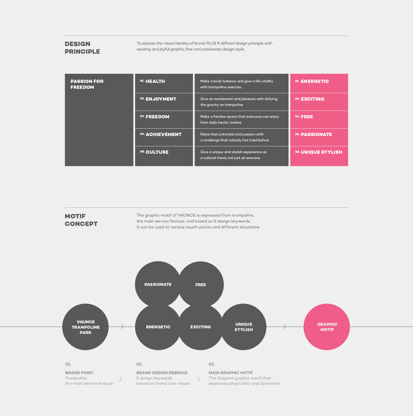
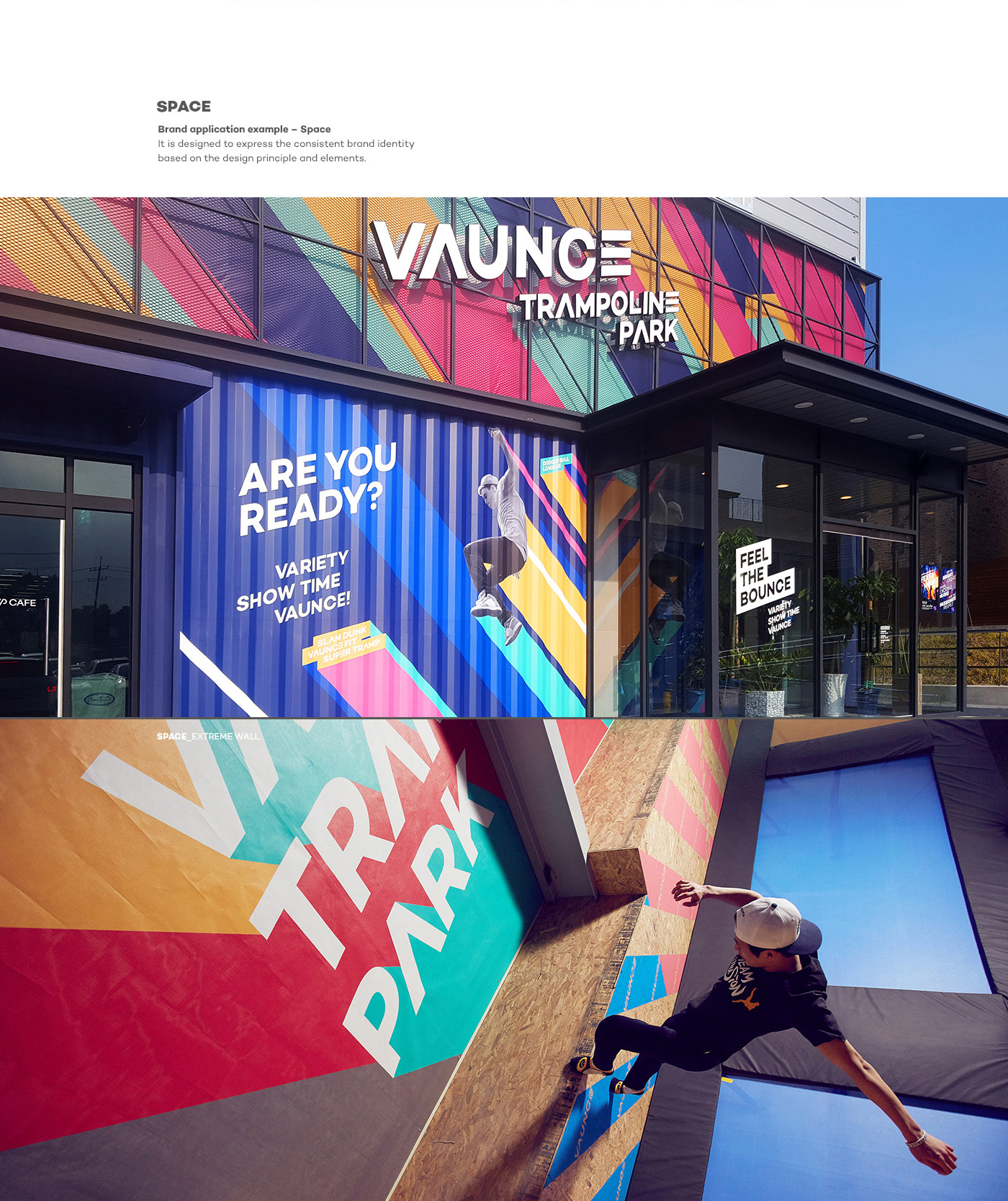
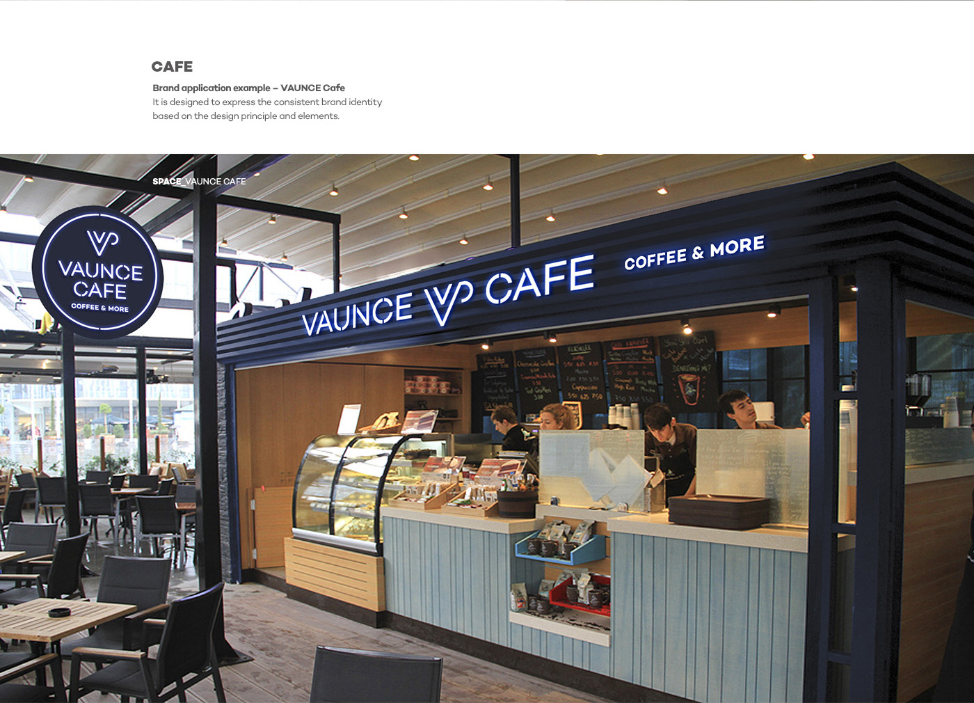
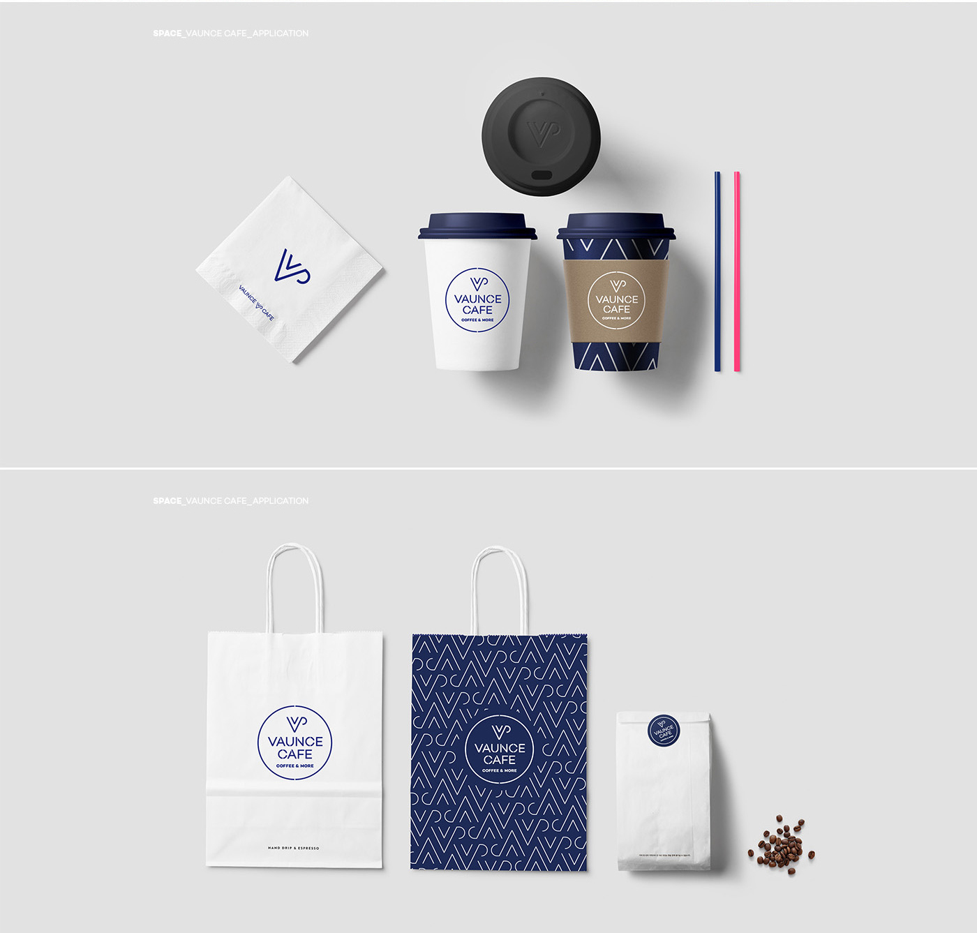
Vaunce Trampoline Park defines five core values, Health, Enjoyment, Freedom, Achievement, and Culture, in order for its brand to encompass passion for freedom with healthy enjoyment in general. Based on these five core values, it needed distinguished design expression language to display its own identity consistently. Therefore, we discovered design keywords, such as Energetic, Exciting, Free, Passionate, and Unique Stylish, created its own look and feel built on the keywords, and achieved consistent communication at the brand experience interface.
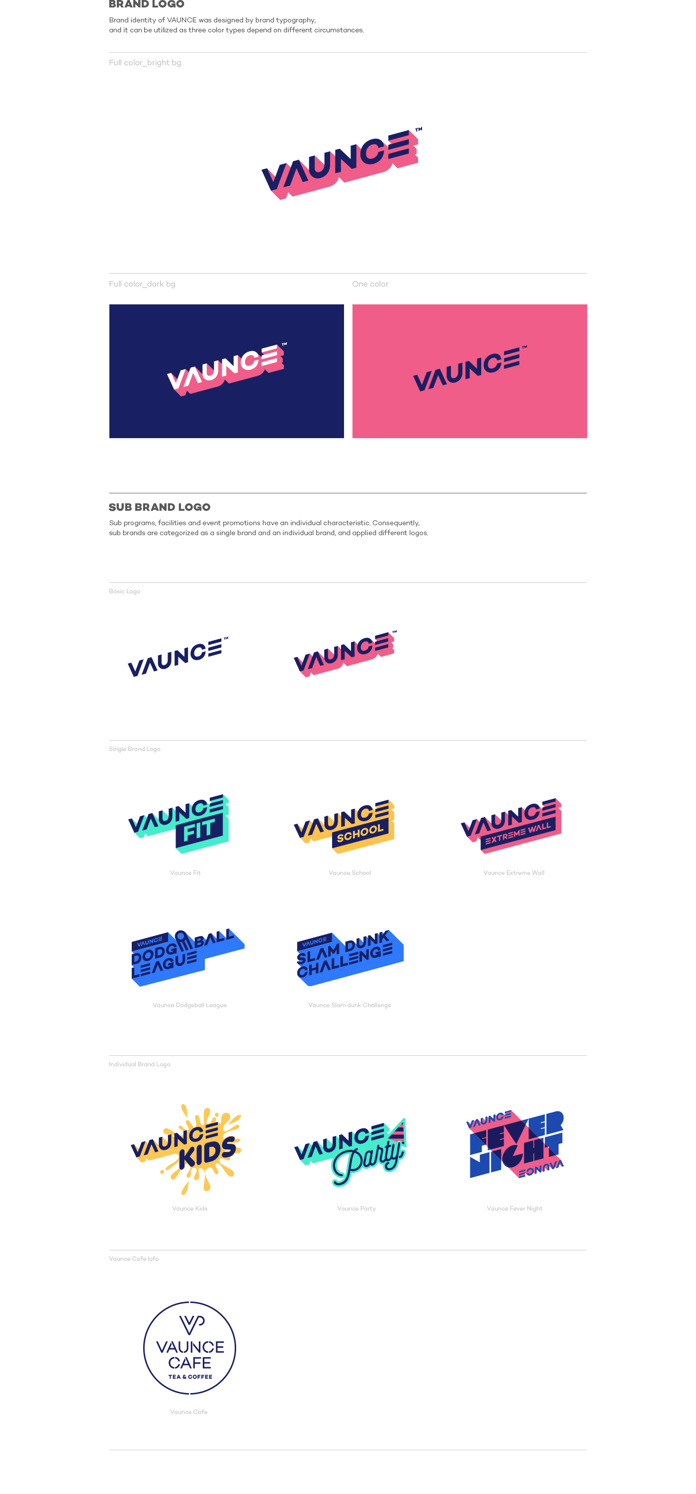
Vaunce Trampoline Park requires communication suitable for target customers and purpose with programs and system operation for diverse age groups. Accordingly, it divided its brand structure into Mother Brand, and two sub-brands, Single Brand and Individual Brand. It maintained visual consistency of the overall brand on one hand, and differentiated colors and tones properly depending on segmented targets for communication on the other hand.
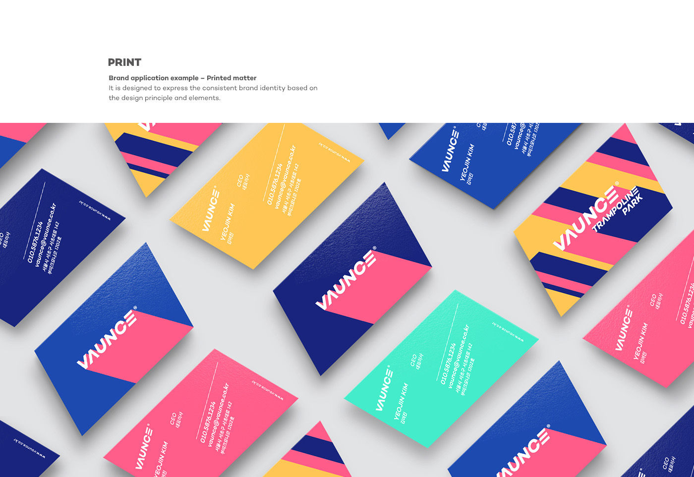
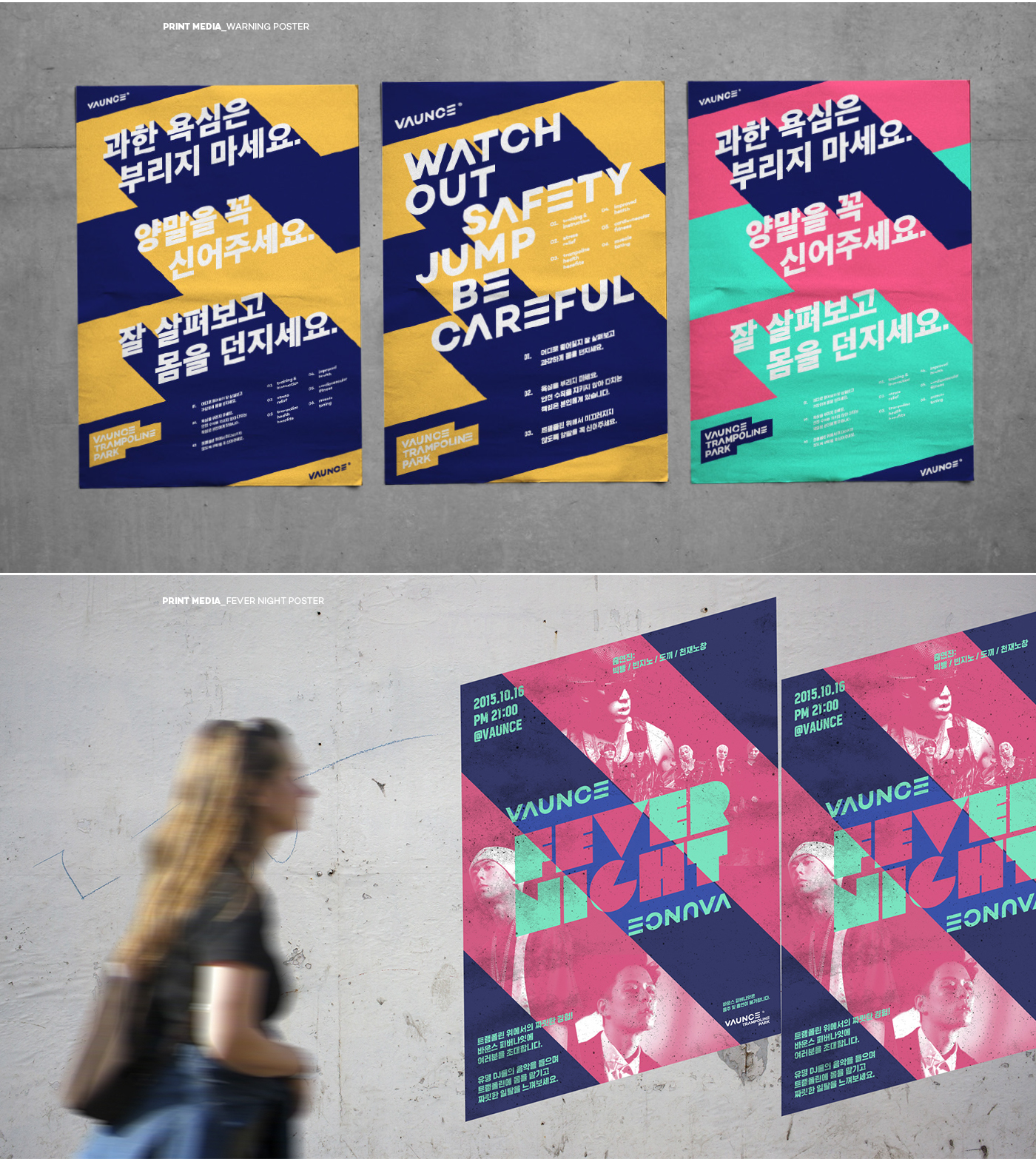
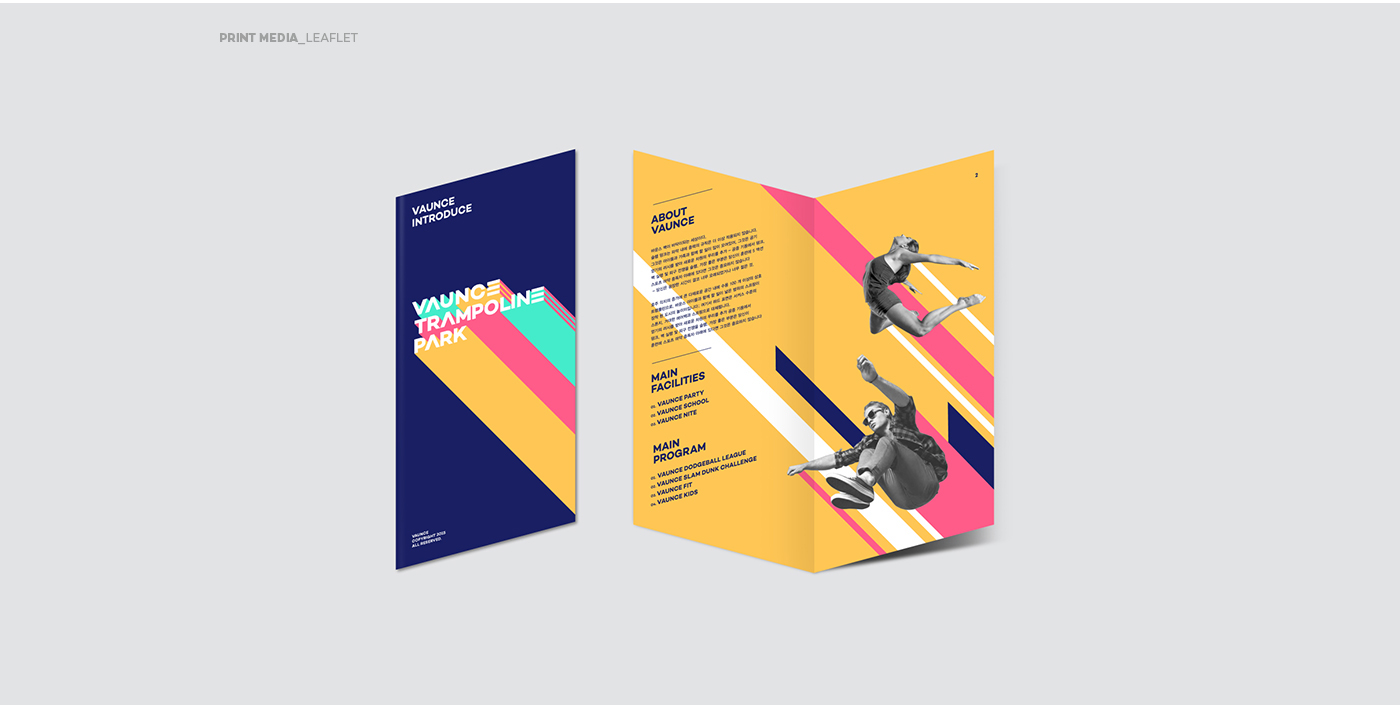
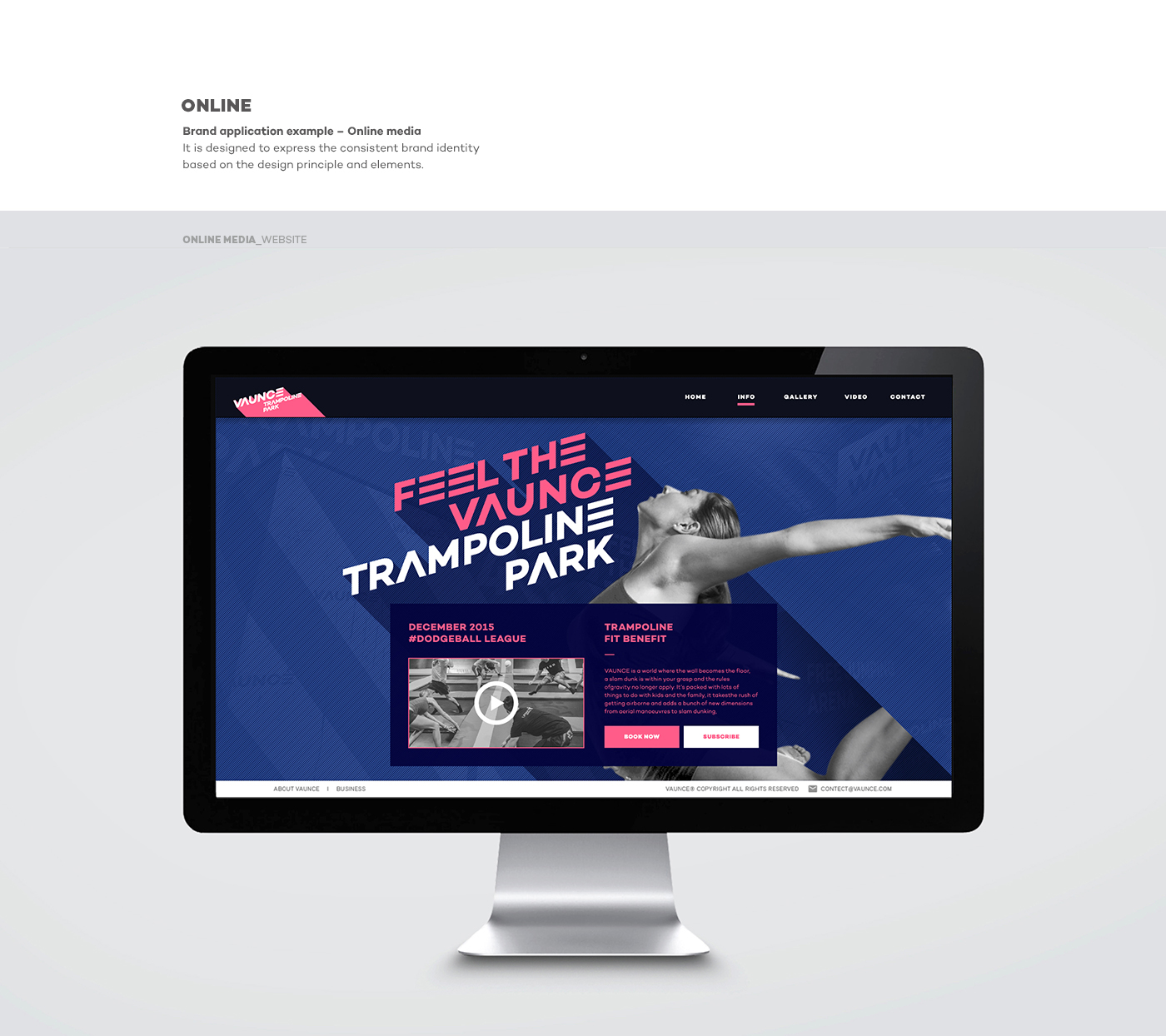
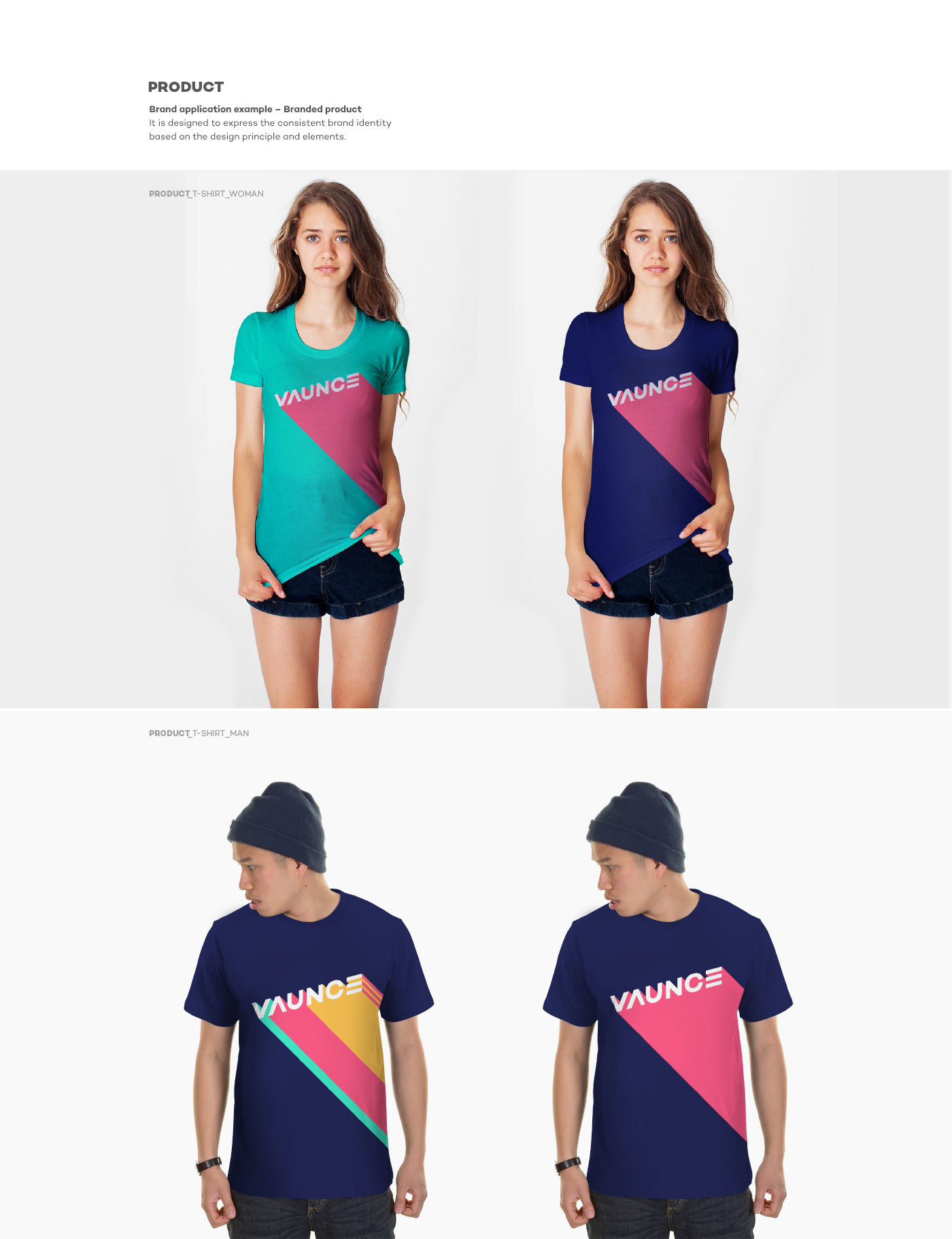
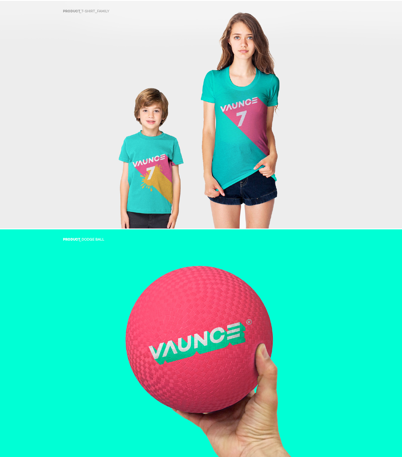
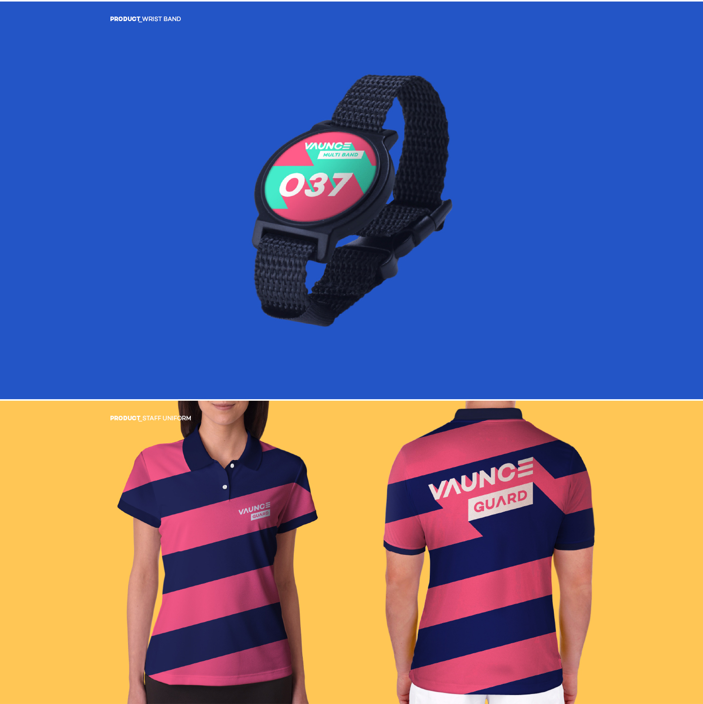
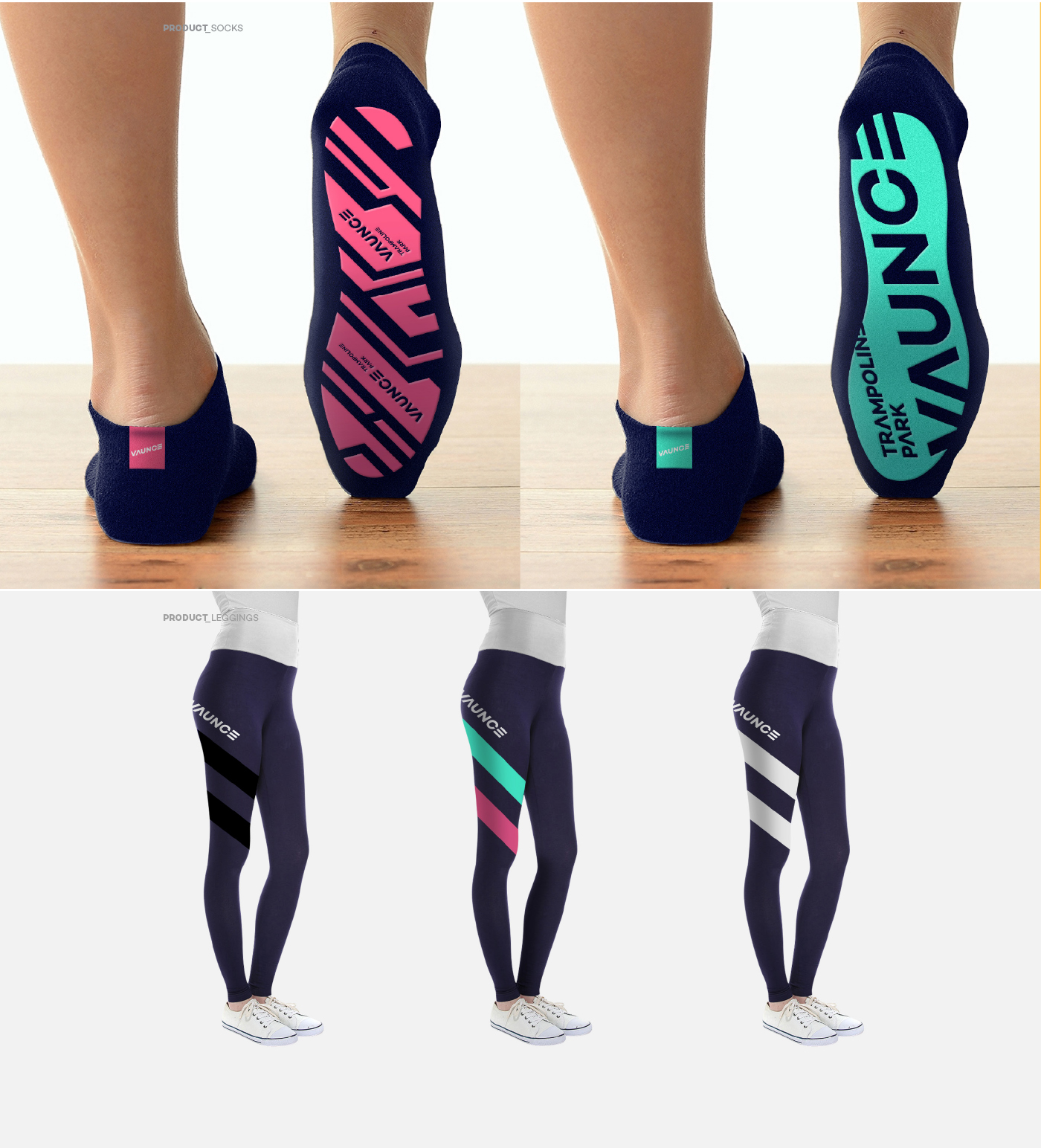
Graphic Design
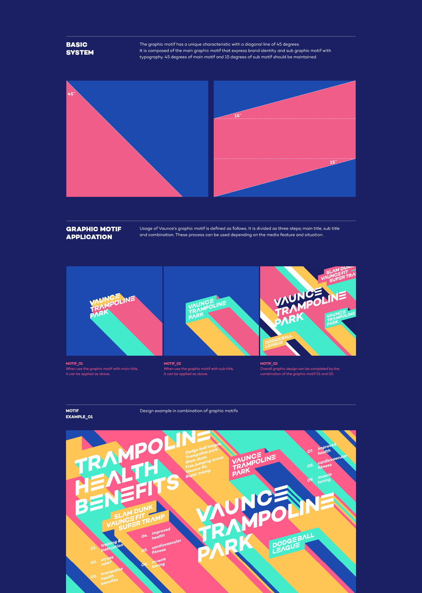
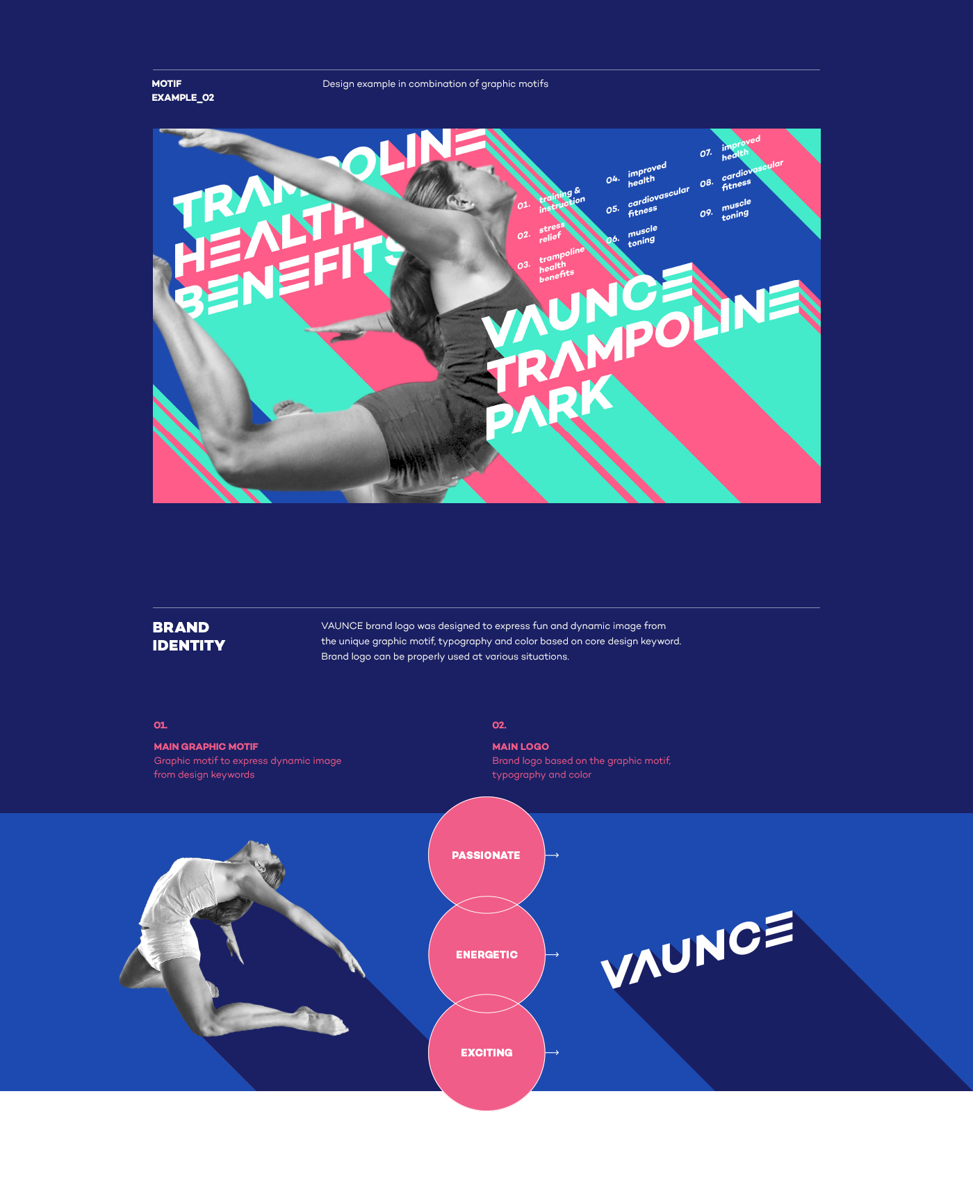
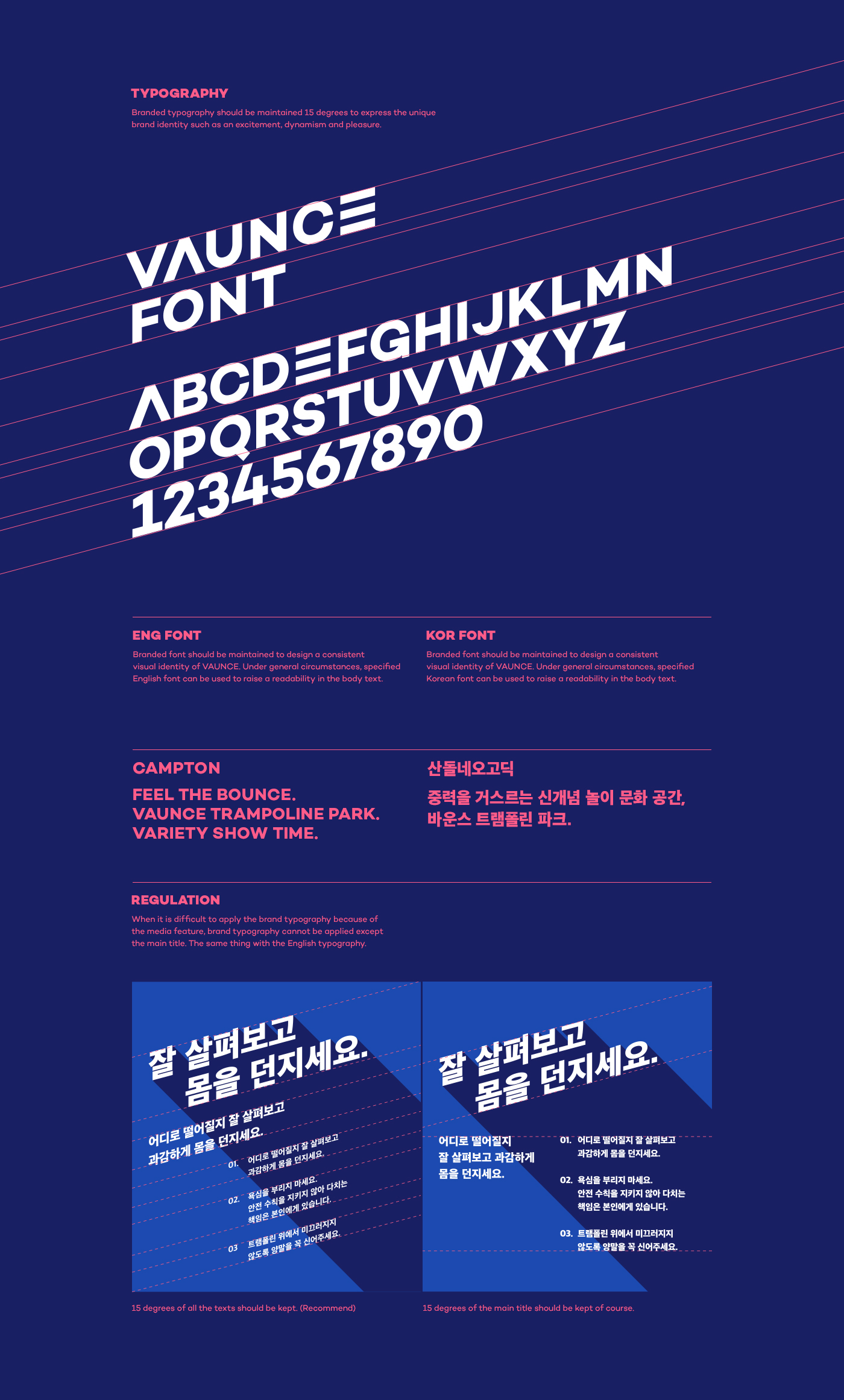
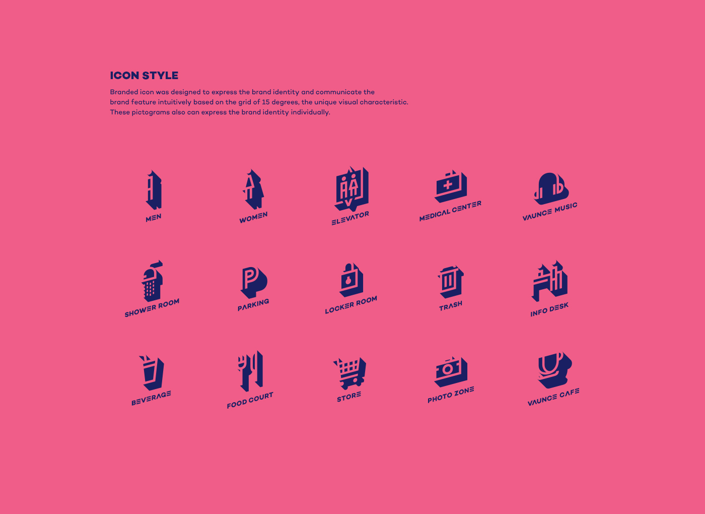
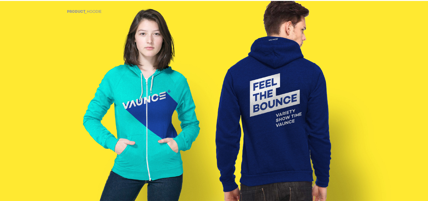
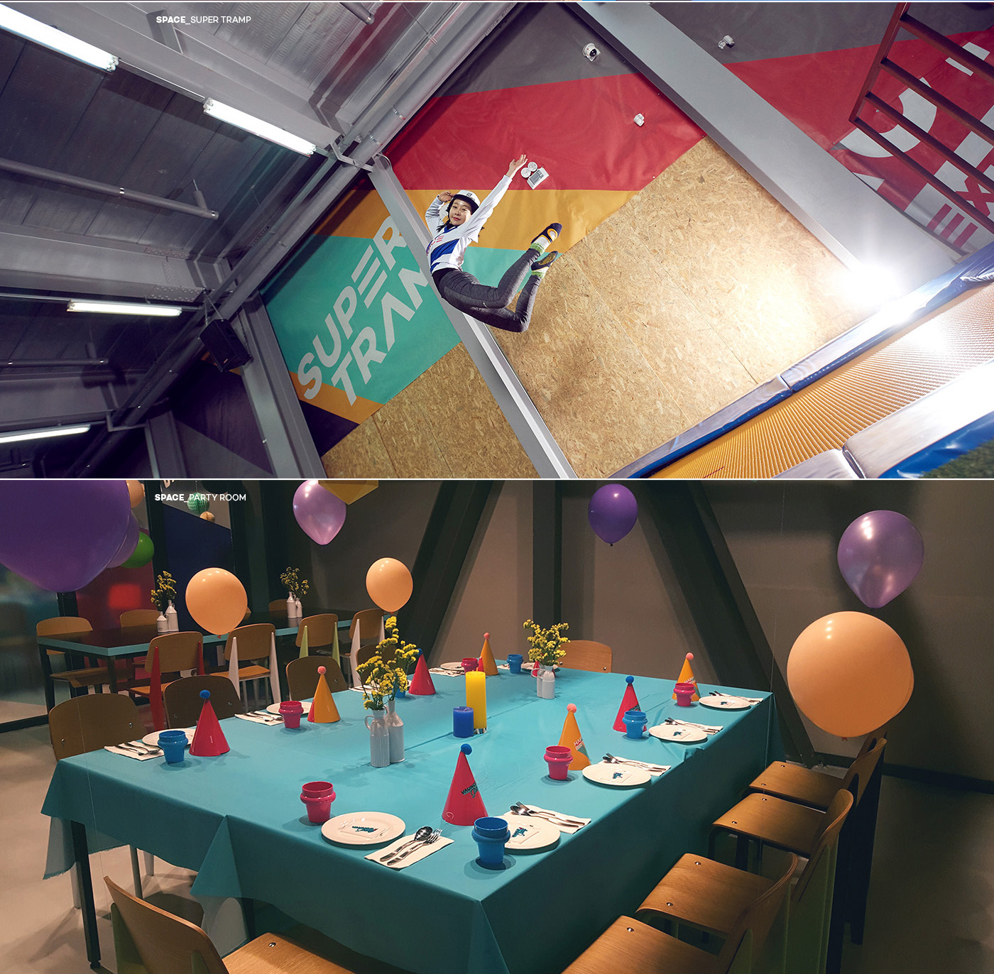
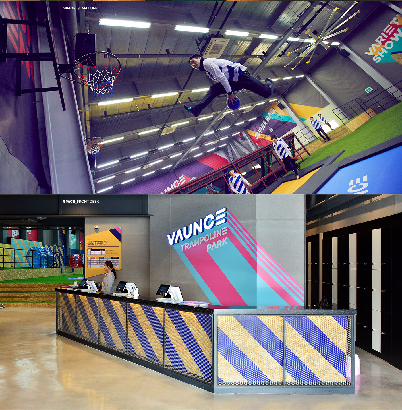
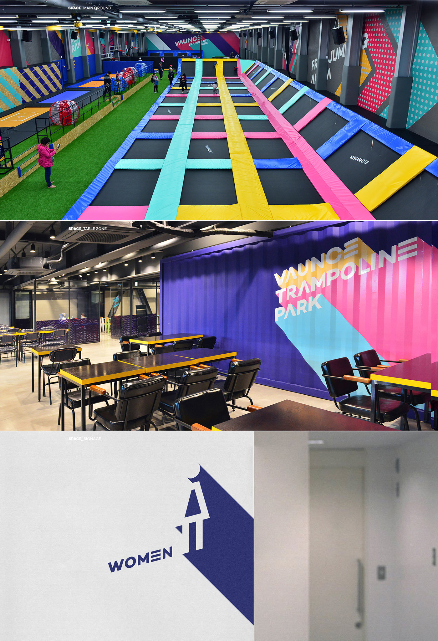
The graphic of Vaunce used a diagonal line of 45 degrees, with a motif of freedom on a trampoline.
This graphic motif helps users experience Vaunce's consistent identity from all design applications, including logo, typography, or pictogram, which represent the keywords of Energetic, Exciting, Free, Passionate, and Unique Stylish, that Vaunce wants to convey.
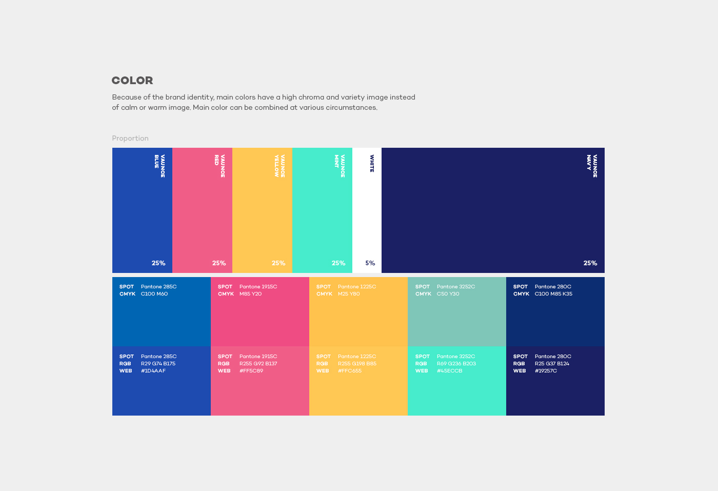
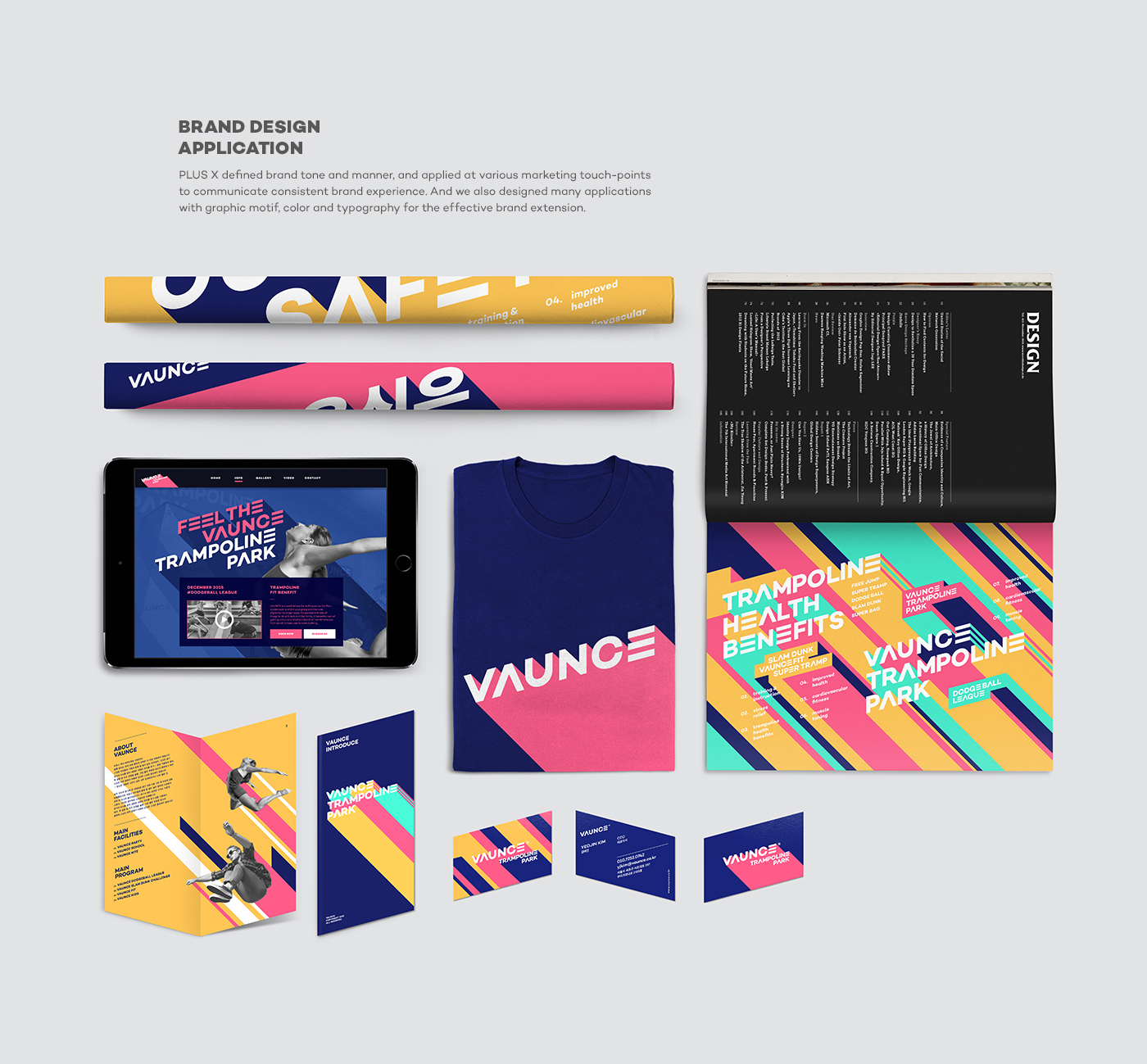
Vaunce designated five vivid colors, blue, red, yellow, mint, and navy, to express its dynamics and energy. The design essence of Vaunce, which is applied to all components at various marketing interfaces, provides consistent brand experiences.
----
Background
???? ???? ????? ??? ??? ???? ??? ???? ???? ??? ???? ??? ??? ???? ????? ???. ?? ????? ??????, ???, ??? ?? ???? ??? ????? ????, ??? ??? ???? ??? ???? ???? ???? ?? ??? ??? ?? ?? ??? ???. ??? ???? ??? ??? ??, ??? ???, ????? ???? ??? ? ?? ??? ?? ???? ?? ? ??? ?? ?? ???? ???? ??? ???.
Strategy
??? ???? ??? ??? ????? ????? ?? ??? ??? ???(Passion for Freedom with healthy enjoyment)? ?? ?? Health, Enjoyment, Freedom, Achievement, Culture?? ?? ??? ????? ???????. ? ?? ??? ?? ???? ???? ??? ???? ???? ?????? ??? ?? ??? ???? ??? ?? ???? ???????. ???? ??? Energetic, Exciting, Free, Passionate, Unique Stylish?? ??? ???? ????? ? ????? ???? ??? ?? Look & Feel? ??? ?? ??? ?? ???? ??? ?? ?????? ?????.
??? ???? ??? ??? ???? ?? ????? ??? ???? ???? ??? ??? ?? ??????? ?????. ???? ???? ??? ??? Mother Brand? ??? Single Brand, Individual Brand? ????? ? ??? ???? ???? ??? ???? ???? ???? ?? ?? ??? Color ? Tone? ??? ?? ?????? ?????.
Graphic Design
???? ???? ???? ???? ???? ???? ???? ?? 45?? ?? ???? ???????.
? ??? ???? ???? ?????? ?? Energetic, Exciting, Free, Passionate, Unique Stylish? ?? ??? ? ?? ???? ??? ??, ??????? ???? ? ?? ??? ???????? ???? ??? ?????? ?? ? ??? ?????. ???? ?????? ???? ???? ??? Blue, Red, Yellow, Mint, Navy ? ????? ???? ??? ??? ???????. ??? ???? ??? ??? ????? ??? ??? ???? ???? ?? ???? ???? ??? ??? ??? ?????.
